Why Do You Need a
Contact Page?
A Step-By-Step Guide for Beginners
I’ve spent hours finding a product that I like, then spend some time trying to search for a place where I could get it from. After hours of searching, I’ve finally found this online store and immediately I wanted to contact them to ask about some shipment details. But here’s the catch, I don’t see a number nor an email, there is no contact page on the website. “Seriously?” You asked, but unfortunately, there are websites like these out there. In the end, I just went to another online store and got the product. Can I search for the contact details on Google? Certainly, but not all will be willing to spend their time and effort to search for basic information like an email address.
Providing contact information is the first step to proving that you are legit. And if you have multiple means of contact, a Contact Page will become the central hub showing your visitors how they could get in contact with you via all kinds of channels. This is how you start interacting with your visitors and potentially turn them into customers. Just imagine a website without any contact information, a bit sketchy isn’t it?
WHAT DO YOU NEED ON A CONTACT PAGE?
The is no set rule on how you should craft your contact page, you can add and customize it as much as you want based on your needs. But in general, a typical contact page would have:
-
Contact Form
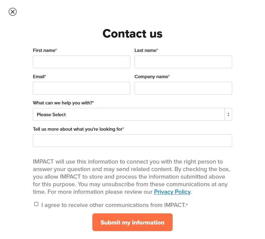
At its essence, a contact form is one way your visitors send in text inquiries, very much similar to what people would do using email. What makes the contact form different is the receiving end (the form owners), streamlining the communication process by gathering, sorting, and organizing information received in the system.
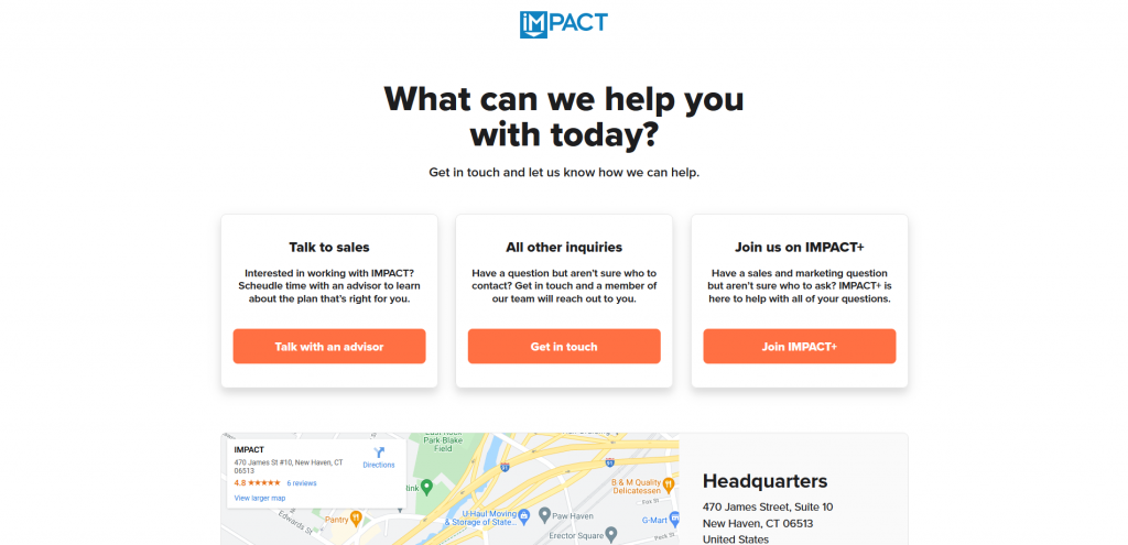
Source: IMPACT
A contact form also provides instructions guiding your visitors to fill in their inquiries and comments to you. The form should be easy to follow, instructional, and straightforward. Make sure to get rid of all the unnecessary fields by asking yourself “is this information needed?”
Additionally, it is strongly recommended to set certain fields as mandatory (“Required Fields”), particularly on fields that are asking for visitors’ contact information. The last thing you would want is to receive an inquiry but you have no way to reply simply because the user forgot to include his/her email address. By activating the required fields, your visitors would not be able to submit an inquiry until they fill out all the necessary fields. While this would not eliminate the possibility of inputting the incorrect information, but at least you wouldn’t be receiving an inquiry with nowhere to respond to.
-
Multiple ways of contact
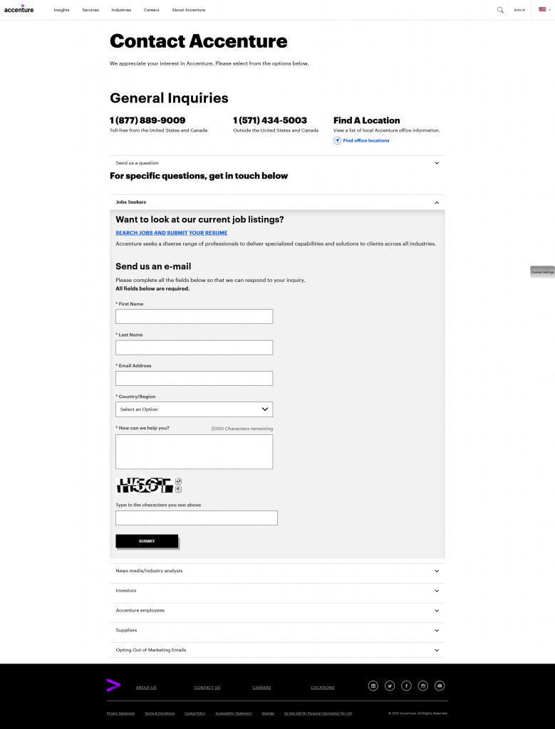
It is usually a good thing to provide multiple means of communication. People have different preferences when it comes to reaching out to others. I, for one, prefer sending in text inquiries (whether it’s an email or via a webform) before making any necessary phone calls or in-person visits.
Source: Accenture
It would also be useful if visitors need to send over an attachment along with the inquiry. They won’t be able to do so until there’s this option in the contact form, which is quite uncommon to have.
-
Map (if you have a physical store/office)
Having a map on your contact page not only are you adding visual elements making it visually interesting, but you are also doing your visitors a flavor by providing visual instruction. Our brain processes images must faster than text. In fact, up to 90% of the information received by our human brain is visual. You will be saving your visitors’ time and effort by embedding a map to your website since they are very likely to copy and paste the address to their map application anyways.
Source: Accenture
WHICH PLATFORM SHOULD YOU USE?
When talking about website building, there are generally two main camps:
- Content Management Systems (CMS)—E.g. WordPress
More flexibility in customization, a lot of resources in the public. But also require more technical expertise, and you (website owner) are solely responsible for maintaining and tackling any issues. - Website Builders—E.g. Squarespace, Website.com, Wix
Easy to use, don’t require much coding knowledge, majority of the platforms have access to customer support. But less flexible compared to WordPress.
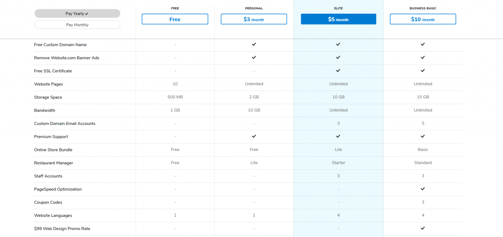
I would strongly suggest using website builders if you don’t know much about website building, having customer support can be lifesaving at times. Of all the different builders, I am happy to recommend Website.com. What makes them different from others? You can use almost all of their website building functions for free, and upgrade to paid plans as you need.
Website.com’s price plans.
A STEP-BY-STEP GUIDE TO CRAFTING A CONTACT PAGE
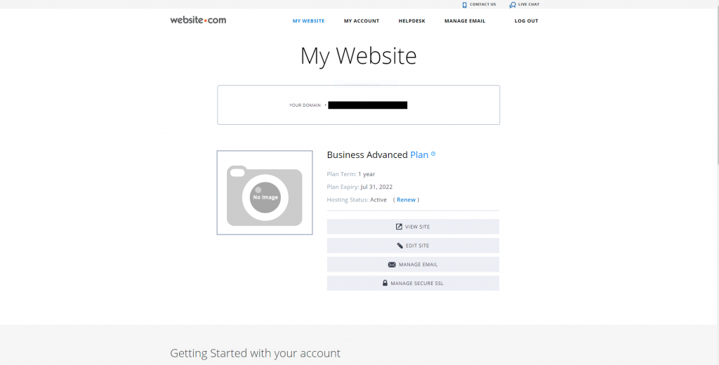
Sign up for a Website.com account, or log in if you have one.
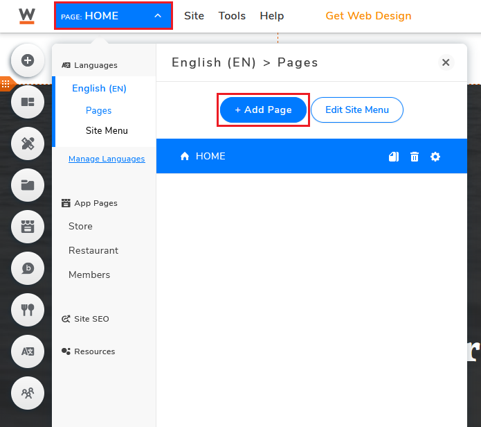
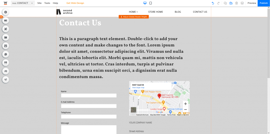
If you are new to Website.com, first choose a template that suits your needs. Once the visual builder loads your website, click Add Page.
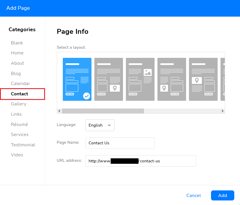
There are several pre-built Contact layouts for you to choose from. Pick one you prefer and start crafting your Contact Page.
You can also choose to craft the contact page from scratch (select Blank instead). But unless you know what you want, I’d always suggest using the templates. You can always customize the details later.
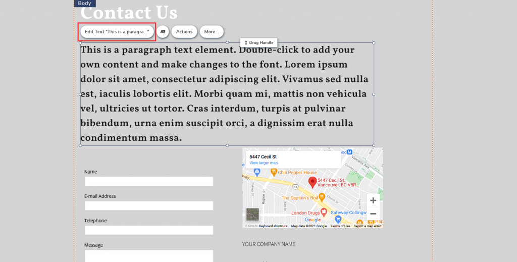
Edit Text: for customizing placeholder text cards
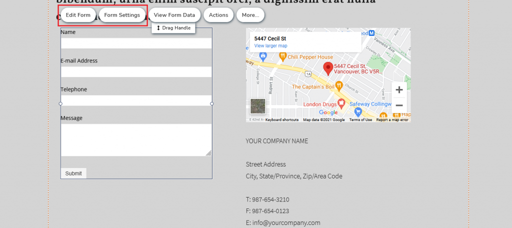
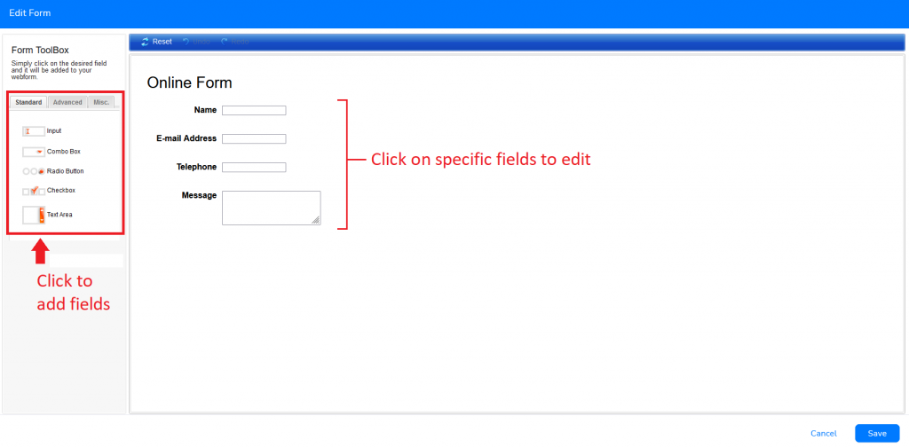
Edit Form: for customizing the content (fields) of the webform
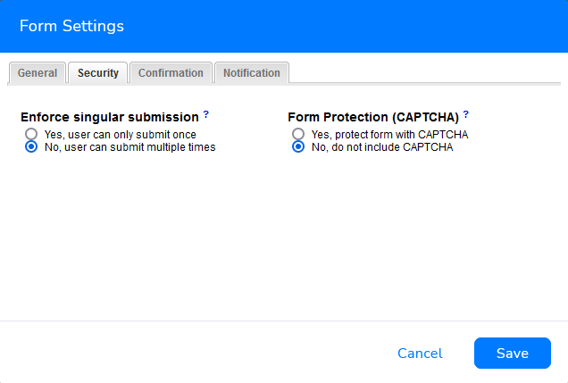
Form Settings: for editing the settings of the web form, such as customizing confirmation messages, activating/deactivating submission e-mail notification, setting redirection URL after submission, etc.
This is also where you can activate CAPTCHA (Completely Automated Public Turing test to tell Computers and Humans Apart) under Security > Form Protection. CAPTCHA is used to prevent spam form submissions by determining whether the form user is a bot or a human via a challenge-response test. Modern-day CAPTCHA tests (2021) usually involve choosing “correct images” according to given instructions.
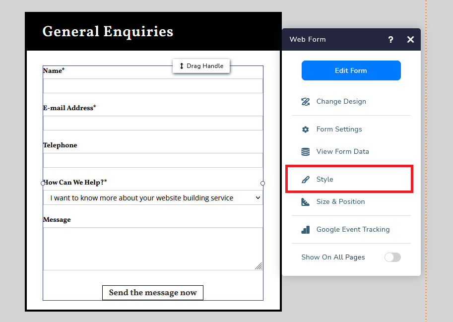
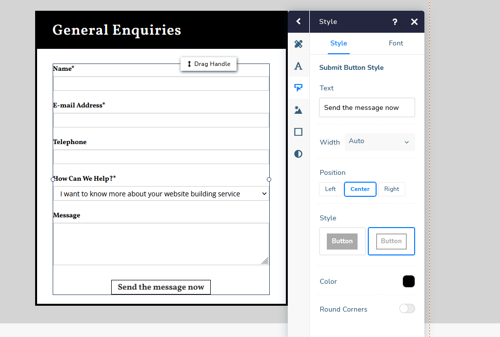
There is one thing that you couldn’t change via Edit Form or Form Settings—the submission button. You will need to go back to the visual builder and click on the webform, select More, then Style.
Here’s where you can customize the button text, the design, and the font. I will later explain why you should consider customizing the submit button.
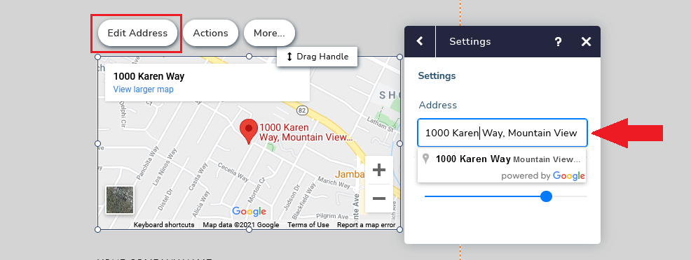
Let’s talk about the embedded map next. To edit the address shown on the map, simply just select Edit Address. Google Map will immediately update the moment you’ve provided a new address.
And if you wish to add more elements to your contact page, click Add Elements or Add Cards. Click here to know more about Website.com’s website builder.
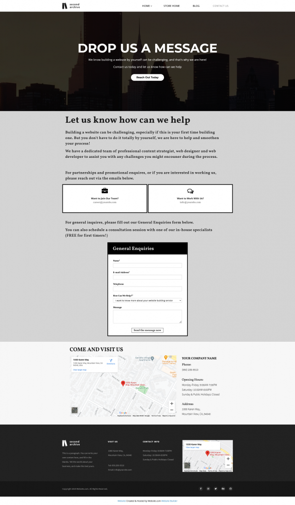
Here’s a Contact Page example of a website building company.
CREATE A MOBILE-FRIENDLY CONTACT PAGE
More and more people are using their phones to go online. Therefore.it is important to optimize your contact page for both web browser users and mobile browser users.
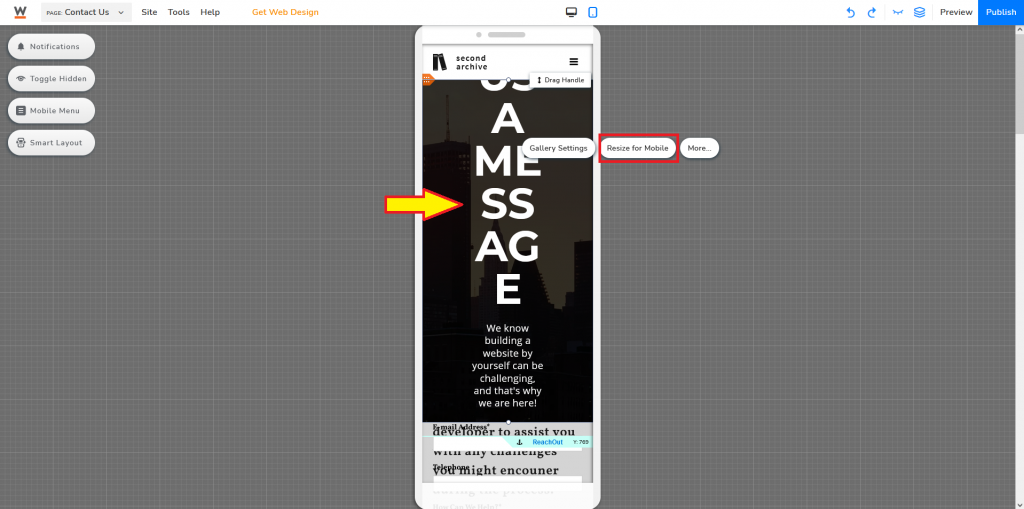
You will find a mobile icon at the top middle area of your website editor, select that to activate the mobile editor.
Not all elements will be optimized for mobile automatically. You would have to select specific elements and click Resize for Mobile.
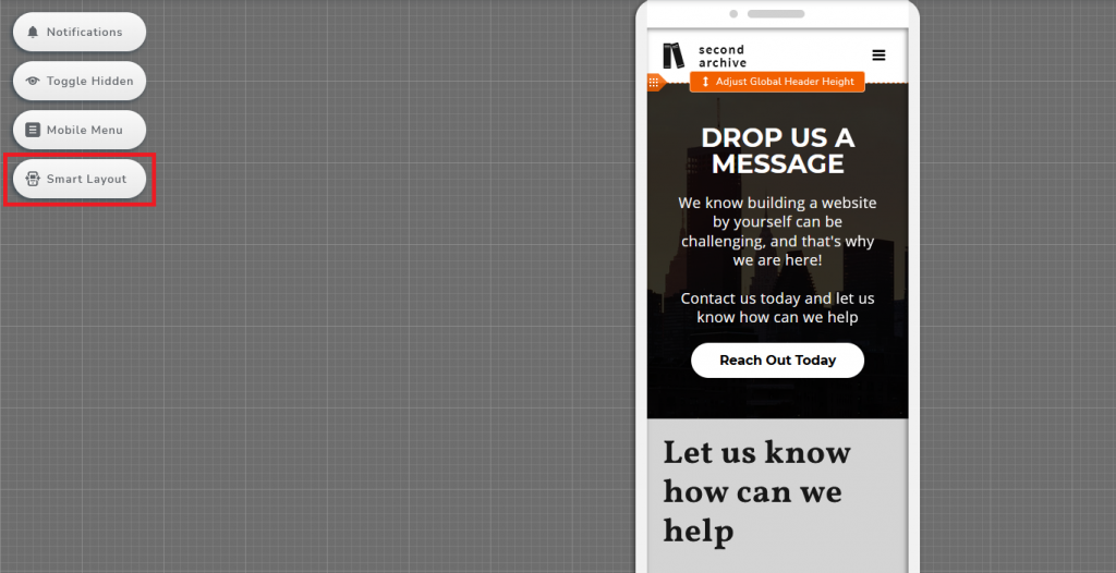
Alternately, you can also try to use Smart Layout.
Either method you’ve used, you might still need to manually fine-tune elements to achieve the exact design you want or what fits best for the mobile screen.
TIPS TO MAKE YOUR CONTACT PAGE STAND OUT
Catchy Call-To-Action (CTA)
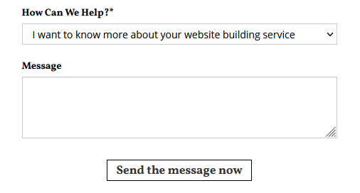
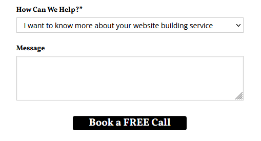
When I say CTA in this context, I’m referring to both instructional messages (such as field titles) and submission button texts. Rather than boring text like “Type of Enquiry”, why not “How Can We Help?” This is not a regular web form, this is how you start to engage with your potential customers. Personalize the messages and make them conversational, incentivize and give your visitors a reason to reach out to you. And if “Send the message now” is too average for you, let’s change it to “Book a FREE Call” and redesign the button.
If you have other dedicate channels for different purposes, remember to also customize those messages too!
Add direction
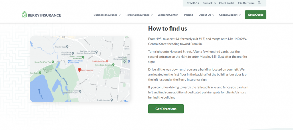
Not everyone is familiar with the area you’re located in, it might even be the first time for some to get to this area. Providing extra instructions on how to get to your place, what street should they be on, and where shall they turn left or right. All these details might potentially be helping your visitors a lot. So they wouldn’t need to constantly zoom in and out of the small map on their phone. (And imagine if your visitor is running low on data, you are helping to a whole lot!)
Source: Berry Insurance
Make it attractive
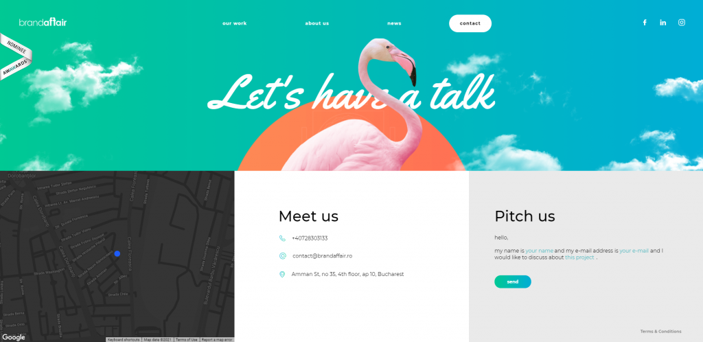
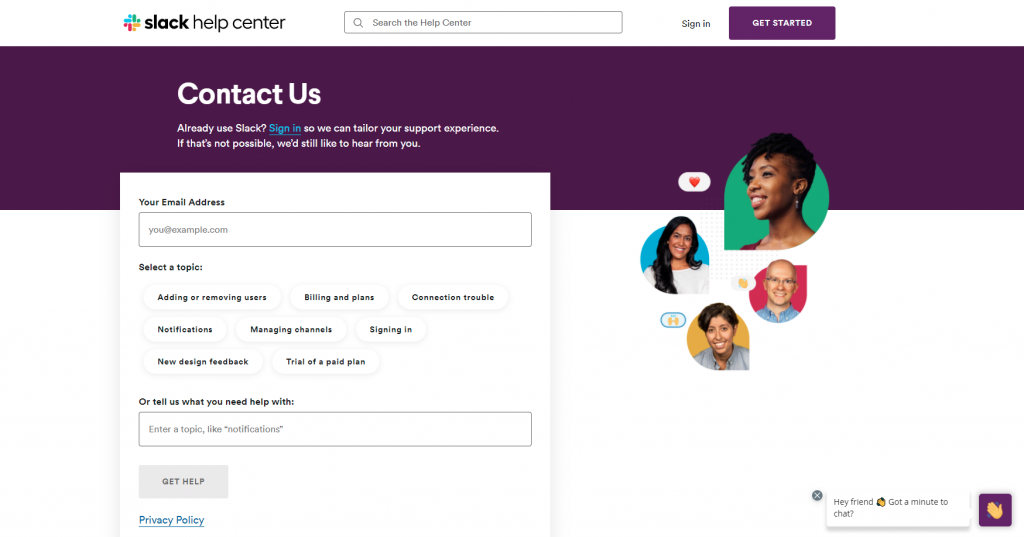
A contact page is equally as important as any other web page. This may not be the first page your visitors may land on, but this is definitely where they will go if they are interested in you or your business. Don’t just throw in all the needed contact page elements without customizing anything (remember CTA!). Add colors, icons, graphics, craft it like how you craft other web pages. The tone of your contact page shall be similar with the rest of your website.
Source: Slack
Having a contact page doesn’t automatically translate to getting interactions. Be active and be interesting, find ways to attract your visitors’ attention, and get them to ask you questions. Whether it’s a paragraph, web form field, or submission buttons, customize all the text so it is speaking the same language with the same tone.
The more engagement you get, the higher chance you can get a higher conversion rate!

