What is A/B Testing
Whenever we are creating a landing page for a marketing campaign, we usually design it based on our previous experience, guesswork, and intuition, hoping to see any positive results.
But the reality is, not all campaigns work equally. A campaign that works for your summer sale might not necessarily give you the same outcome for your winter sales campaign. And this is when using a data-driven approach can lead you in the right direction.
WHAT IS A/B TESTING?
A/B testing, also known as split testing, is a marketing experiment to compare and test two variations of an ad, a mobile page, or a web page. The aim is to determine which version is more effective based on statistical analysis.
HOW DOES A/B TESTING WORK?
To conduct an A/B test, you will first need to create two different versions of the same content. And by “different”, I’m referring to making changes to a specific variable.
After creating the two versions, you will send them off to two randomly picked, similarly-sized groups of audiences. One controlled (the current, already in used version), against one challenger (the variation) to see which would lead to better results.
Note: It is not a must to stick with changing just one variable. But generally speaking, it would be much easier to determine which element could be making a difference if you’ve only changed one.
There are mainly two kinds of A/B tests.
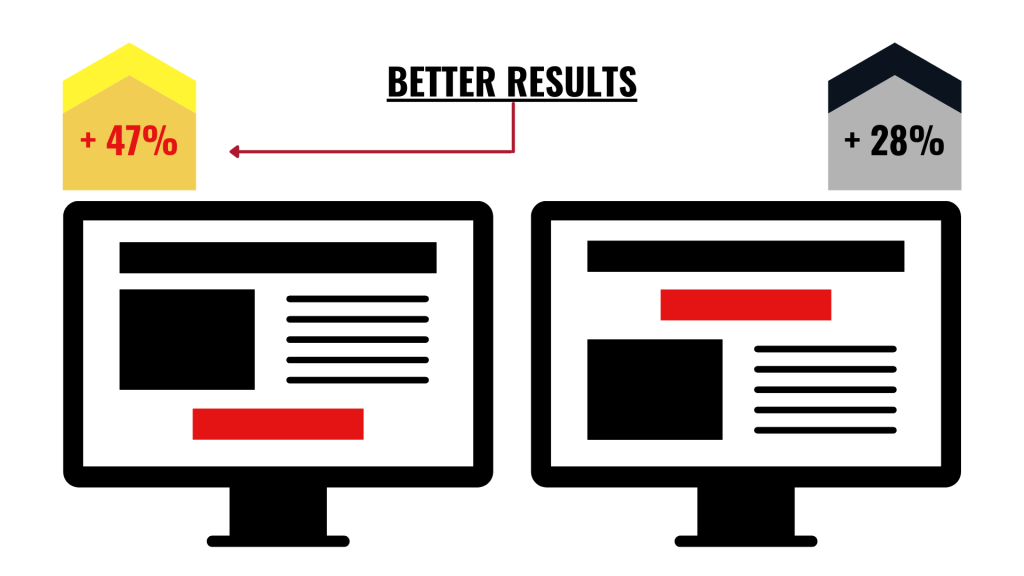
One that focuses on the user’s experiences. For example, the placement of the call-to-action (CTA) button. (See graphic above)
Or one that focuses on the design, like the color of the CTA button.
Regardless of which focuses your test is based on, ultimately, it is about seeking the option that brings you the best possible results.
IMPORTANCE OF A/B TESTING
A/B testing can bring huge benefits to your business. A simple tweak like changing the CTA button color, minimizing navigation links, or changing the placement of texts could make huge differences. Some of the common benefits include:
Increase conversion
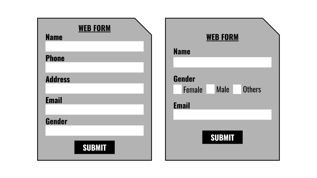
Anything could change the way your visitors interact with the CTA button on your marketing page. A CTA button could be a bright and obvious button in the middle of your web page bringing your visitors to another page, or even the submit button of a web form. Only by getting visitors to click that button, you can then convert them into leads.
Lower your bounce rate
A high bounce rate occurs when your website visitors are leaving your web page soon after landing on it.
There could be several issues here. You have too much content, boring text, a dull-looking page, hard to read font combination and size, or a messy web page layout. All these could result in turning your visitors’ interest off.
Your goal for conducting an A/B test? Testing variations to get the “right element”, so to retain more visitors and convert them to potential leads.
Reduce your abandoned cart
On average, 70% of worldwide customers will abandon their shopping carts before completing their online purchases. While there could be different reasons for this, including how your potential customers just didn’t feel like spending money. But it could also be a simple design flaw resulting in a loss of hundreds, thousands of dollars.
Try changing the placement or the color of your product ribbons, change the location of your promotional code (the coupons) on your online store, change the feature photo photos. Run the test and see if there are any improvements.
Know your audiences better
By the end of the day, conducting an A/B test is all about identifying what your audiences are more interested in and willing to take a step forward. It is all about analyzing how such changes would impact visitors’ behaviors, hence understanding what works, what doesn’t.
A/B TEST CHECKLIST
Now that you know what an A/B test is and what benefits it can bring to your website and your business. It’s time for you to do some experiments to check out what works best for your marketing campaign.
If you haven’t had a website, you have two options depending on your level of expertise. For tech-savvy ones who know how to code, feel free to use content management systems like WordPress to gain full control over your website. But if you are just starting your online journey, go for website builders like Website.com, Wix, Squarespace instead.
The good thing about website builders? It is easy to use and usually comes with a free plan option. For instance, check out Website.com’s website builder website plans, it is mostly free with almost full access to their website building features.
Here’s a checklist before you start conducting test:
- What interface are you testing it on? (E.g. Web browser VS Mobile screen)
- What feature(s) / element(s) are you testing?
- Create two versions of the same email, marketing page, web page, mobile app screen, etc.
- Decide your sample size and the duration for running the test
You might be tempted to test every single small element to make it perfect, but this could also be very time-consuming. Instead, focus on the several elements that are likely to make huge impacts, such as:
- Top banner
- Headline
- Product image or graphic relevant to your business
- CTA button design, and placement
FINAL THOUGHTS
There are quite a lot of tools available. For instance, Google Optimize could be one, plus it’s free!
A/B test is probably every website owner and marketer’s best friend”. It is the tool that helps you figure out what works best and drives the most conversions for your business.


