Design, create & publish effective marketing pages
New to marketing pages or getting ready for another launch? From articles, guides, to simple illustrations, you’ll find everything you need to get started. And get better.
Quick "HI!" from the author!
I know building a website can be exhausting if you are new to this game. This is why I’ve created this guide to help all of you smoothen your process when creating a website for you and your business!
And no worries if you don’t know how to code. I don’t have a background in computer science or web development. But I specialize in creating content, from researching and writing, to building websites via any available tools.
If I can do it, so do you!
How Can This Website Help You
Step-by-Step Guiders for Beginners
How to build a website? How to start an online store? How to create marketing pages that generate leads?

Content Creation Tips
How to write better content? Tools for creating multimedia content? What kind of content should you create to improve website traffic?
Online Marketing Best Practices
How to optimize your website for search engines? How can you effectively promote a website? Tips to optimize content for different social media?
Turn visitors into customers
Every successful conversion starts with an effective marketing page.
A marketing page average conversion rate was around 2.35%, with the top 25% of best-performing marketing pages converting at above 5%. Some even converting near 12%—the top 10% performing pages. Businesses generally increase conversions by 55% if they have 10-15 marketing pages, as compared to those with less than 10. And those with over 40 marketing pages? Conversions increased by over 500%!
How to Create a
Marketing Page
What is a marketing page?
Before we start, let’s first talk about the term “marketing page”.
A marketing page is an independent web page usually with promoting purposes. Say if you are advertising on social media posts or through email marketing and you’ve included an URL link with your promotional materials, this is very likely the first web page your visitors will land right after, setting the very first impression of your promotion.
Different from regular website homepages, marketing pages are typically designed with a specific goal in mind. Imagine attending a networking event, a “website homepage” is your existence in the event, while a “marketing page” is the greetings and handshakes you make when engaging with others.
If you craft your marketing page correctly, you can transform your marketing page into a lead generation machine for your business.
Note: You might have come across the term “Landing Page” and wondering if it’s something different. The answer: it is essentially the same thing.
Goal of Your Marketing Page
Are you promoting a product that requires people to buy online? Are you promoting a service that requires people to sign up? Or are you using it as a teaser to get visitors to the “main page” you want people to go to? Whichever it is, crafting a marketing page will take you closer to achieving your goal. That being said, marketing pages typically fall into one of these types:
-
Click-Through Page
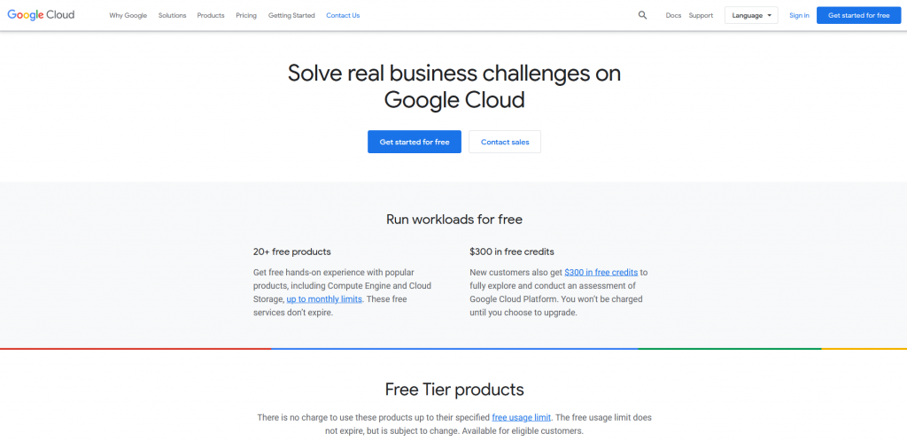
A click-through page perhaps is the most popular type of marketing page. What makes it different from other marketing pages? There’s no web form for people to fill out, only a call to action (CTA) button for people to click on. The goal is to persuade visitors to click that button and get them into your sales funnel.
Source: Google Cloud
-
Infomercial Page (or “Sales Page”)
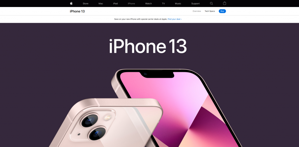
This is a long-form marketing page aimed to keep visitors on the web page and engaged with the content, to make them read through the page from top to bottom. Typically you will find a lot of information about a particular service or product on this type of marketing page, such as multiple “sales pitches”, product photos, and customer testimonials. In short, while other marketing pages prioritize information presented on the page by providing navigation links for visitors to browse additional information elsewhere (preferably within the same domain), infomercial pages will have almost everything on them, making it possible to be a standalone advertisement web page.
Source: Apple
-
Lead Capture Page (or “Squeeze Page”)
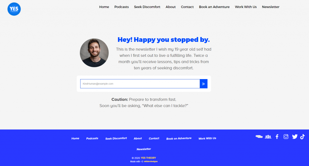
Similar to a click-through page, a lead capture page is also aiming to turn a visitor into a lead. However, rather than clicking the CTA button and bringing the visitor into the sales funnel, lead capture pages are focused on collecting specific information from the visitors. The idea behind this is to persuade visitors to willingly provide their information, usually their email at the very least, to “squeeze out” their information by providing something valuable in return. Basically, anything that requires you to sign up, that’s already a kind of lead capture page.
With the revival of newsletters (I mean, just look at the rise of Substack and FaceBook entering the newsletter game with Bulletin), you will come across a lot more web pages (or popups) asking for your email, in return to get content that you like in your every mailbox every month, bi-weekly, weekly, or even daily.
Source: YesTheory’s newsletter subscription page
Marketing page must-haves
Everyone designs their marketing pages differently depending on their needs. But several elements will exist on every marketing page out there.
-
Hero Banner
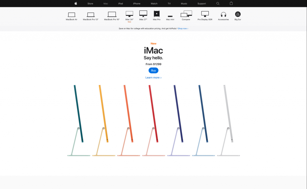
Hero banner is a full-width section that is viewable on a person’s screen before scrolling, or the website jargon—any content ”above the fold”. A hero banner should be eye-catching enough to capture your visitors’ attention once they land on your marketing page. Ideally, it should be captivating enough to get your visitors scrolling. And hopefully, keep scrolling.
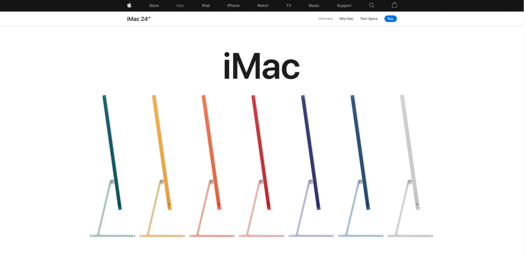
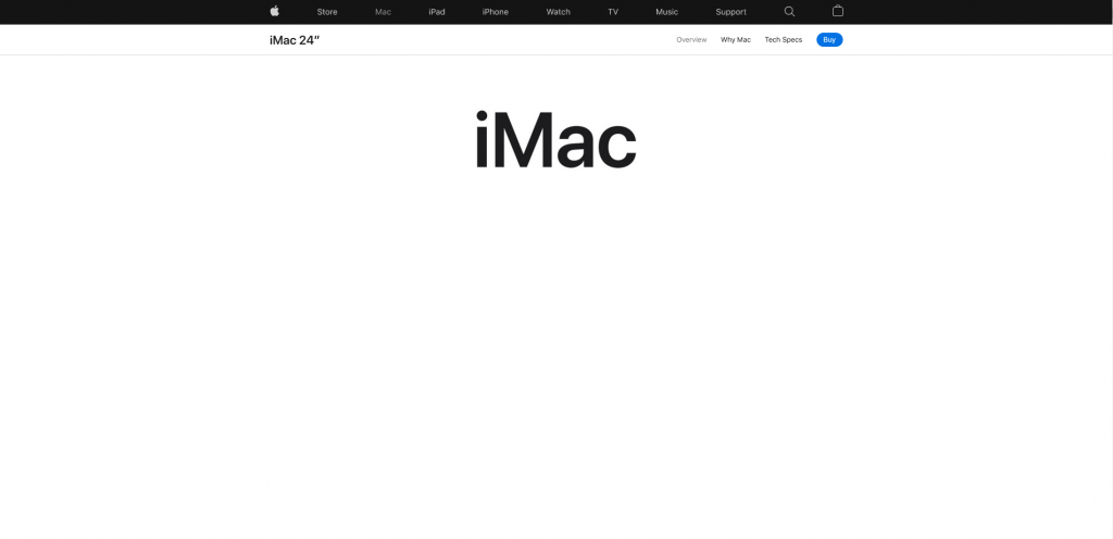
It is also important to note that other than creating a visually interesting hero banner, not including the most vital information within this section will defeat the entire purpose of creating a dedicated marketing page. Just imagine seeing Apple’s iMac web page without seeing the iMacs as soon as it loads. If this is a product promotional page, I would have expected to see the product photos in the very beginning.
Source: Apple
-
CTA Buttons
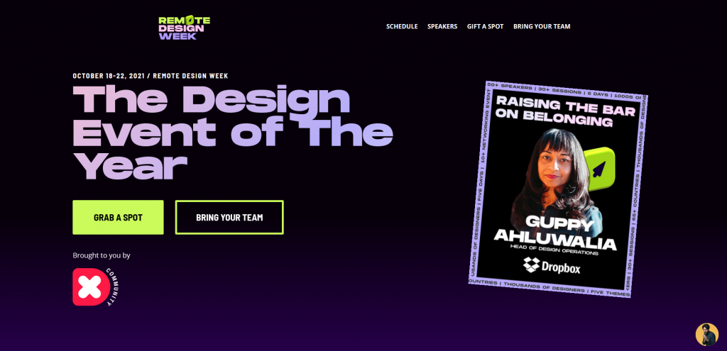
A CTA button is basically a navigation link you want your visitors to interact with, guiding them to a specific destination and hopefully, make and complete a conversion. To put it in simple terms, imagine you are promoting an event, your CTA button will lead them to the event registration page.
Hero banner of the page, bright CTA Button in green
Straight to purchase and payment section after clicking ”Grab a Spot”
-
Web Form
There are two main purposes for using web forms: (1) collect user’s information, or (2) communicate with users. The length, elements, and formats of a web form varied case by case, but in general, a web form should include:
- Clear headline
Your visitors shouldn’t be asking “what do I need to give” when filling up the form
- Relevant form fields
When filling up the form, form fields should make sense as to why users would need to provide the specific information needed. For example, if you are asking people to subscribe to your newsletter, it wouldn’t make much sense to ask for the user’s physical address and phone number.
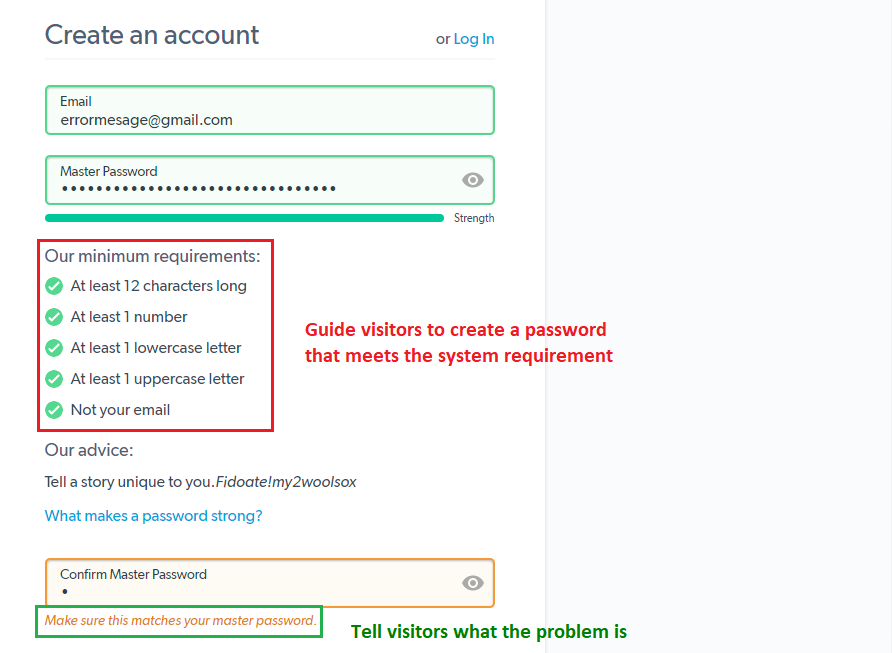
- Error or Instructional Messages
These are used to guide visitors to input the required information in the form. And if the user failed to input the “correct” data, error or instructional messages will explain the issue and assist to get it right.
Source: LastPass
- Submission Button
Obviously, you need to have a button for users to submit the form. Web forms, regardless of their purposes, wouldn’t be complete without a submission option.
Different types of web forms
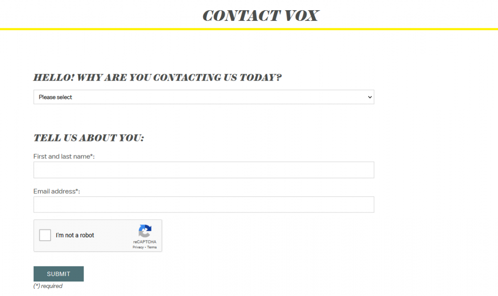
Contact forms
This is how your visitors ask questions, voice concerns such as giving a reason to why seeking a refund or just to connect.
Source: Vox Media
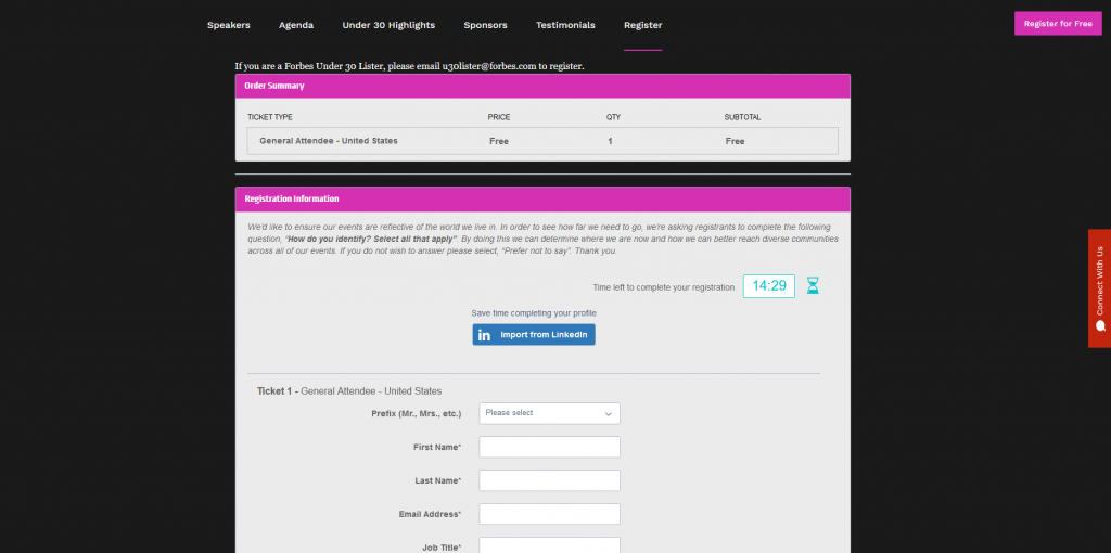
Registration form
Commonly seen with event registrations, organizers will use these forms to collect personal information of attendees for marketing purposes and potentially for verification purposes during the event.
Source: Forbes (2021 Forbes Under 30 Summit)
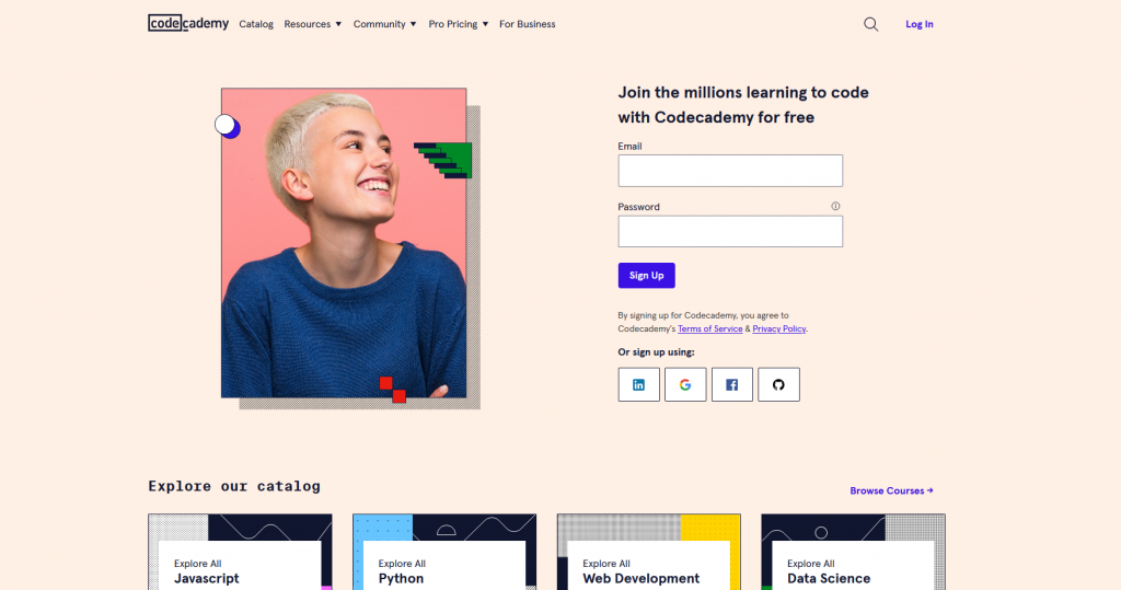
Lead generation form
Similar idea to the lead capture page (mentioned above), the main purpose of a lead generation form is to capture the email and other information of web page visitors and convert them into potential leads. In some instances, the web form may also require users to create a username and password if your website offers online services.
Source: Codecademy
Choose a platform for your marketing page
There are plenty of options out in the market for you to create a marketing page:
- Content Management System (CMS) platforms such as WordPress, Joomla, and Drupal are what we call free and open-source web content management systems that offer much more flexibility when it comes to building a website. But this flexibility and level of customization come with a price, these platforms require a bit more technical expertise and have a steeper learning curve. If you know some coding and are willing to spend hours adding and modifying the code, this is the platform for you. That being said, due to its nature as an open-source platform, even with tons of guides and tutorials available online, you are pretty much on your own and you are responsible for dealing with any technical issues you encounter.
- Landing page builder is a kind of online builder dedicated to creating marketing pages using one of the many templates available. Just a small reminder, “landing page” and “marketing page” are essentially the same thing with different names. Some of the more popular landing page builders include Instapage, Leadpages, and Unbounce.
- Website builders such as Squarespace, Wix, and Website.com are very much similar to CMS platforms. It does manage content (e.g. blog posts) like CMS, but website builders are more focused on providing the tools for users to build a website by dragging and dropping different elements anywhere within the visual website builder interface. Website builders tend to be much more intuitive and easy to use, it is super user-friendly, particularly for beginners. But at the same time, it is relatively less flexible and customizable as compared to CMS platforms.
As you start thinking about having marketing pages to help promote your business, sometimes it’s also worth thinking a bit further on whether you might also want to build a website that goes hand in hand with your promotion. (Remember the marketing page as greetings and handshakes reference that I’ve given earlier?)
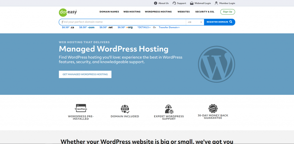
CMS platforms are genuinely a bit harder to master, making them not the most ideal option for everyone. However, if you’d wish to take on the challenge, say you opt to go for using WordPress to build your website, you certainly can. Meaning you will also need to look for a web hosting service company to host your website. There are plenty of companies that host WordPress websites, but I would personally recommend choosing Doteasy as it also offers WordPress pre-installation service and auto-update service.
Source: Doteasy
Another big advantage for choosing Doteasy is its in-house customer support team. Like mentioned a while ago, WordPress is known for its flexibility and customization. And oftentimes you will need to install different kinds of plugins to fully utilize the platform. However, WordPress is a CMS platform with frequent system updates.
I have come across multiple technical issues like website display changes or certain plugins stopped working after a WordPress system update. There are several scenarios, most commonly due to coding conflicts between WordPress and the theme and/or plugins after system update as there weren’t any available theme and/or plugin updates to accommodate the changes in the WordPress system. I’ve tried Googling a solution, but oftentimes I will encounter complicated CSS codes. I would not prefer to touch simply because I know nothing about CSS codes and would never want to mess up anything in the system.
After several failed attempts of finding a solution that I am comfortable using, I’ve decided to reach out to the Doteasy customer support team for help. Although I’ve ended up resolving the issue by using a set of CSS codes, at least it’s a set of code written and provided by their in-house WordPress expert and web developers specifically for my case. Thanks to the set of customized codes and clear instructions on how to use it, I’ve successfully resolved the issue without crashing my website.
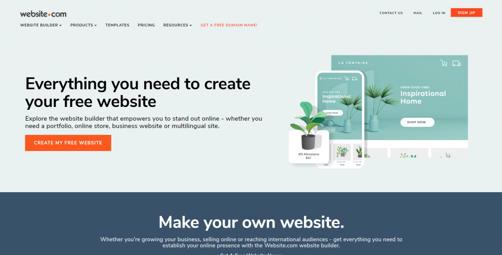
With that, I’ve soon decided that website builders might be a better option for me. After trying out different builders, I am happy to suggest using the website builder developed by Website.com. What makes it a bit different from other options out there? I can use almost all their platform features for free. And whenever you feel like you need extra function or memory space to host your content, you can always upgrade to the paid plans whenever you need.
How to create a marketing page?
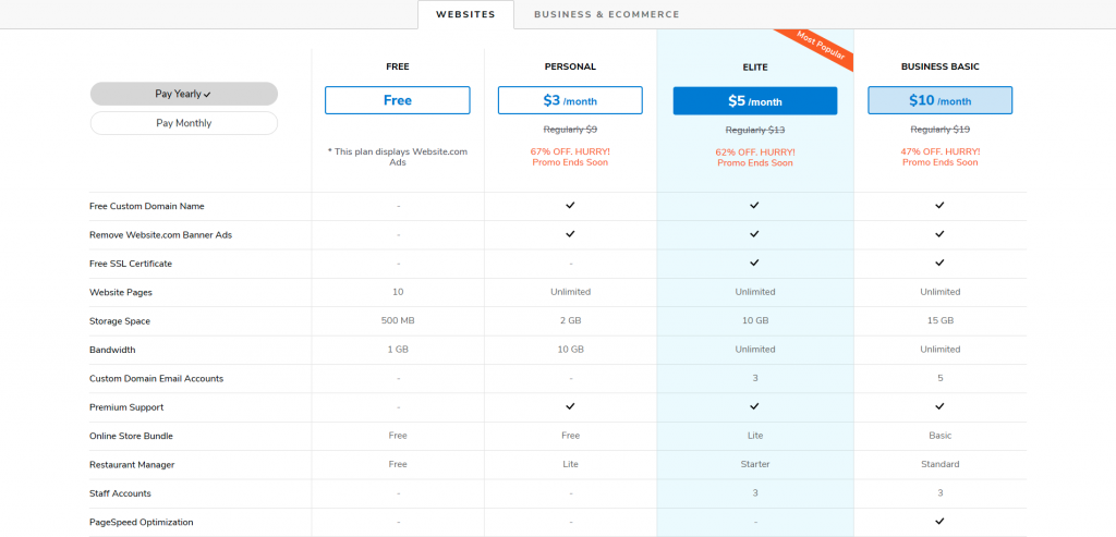
Go to Website.com and select a plan.
Website.com’s price plans
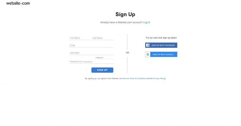
After choosing a plan, you will be lead to Website.com’s sign-up page. You can also opt to sign up via your Facebook or Google account
Create your domain name
At this point, you will need to create a domain name for your website, this is essentially your “online name”. I have signed up for a paid plan to get a free custom domain name, this is crucial and always preferred if you are serious with your business. It boosts credibility and is easier for people to search for your website.
Here are a few tips on how to create a professional domain name:
-
Use of your name or your business’ name
Your domain name is how people identify you online. If it is a personal portfolio, use your name. If it’s a business website, use your business/company name. If your ideal domain name has been registered, say because you have a relatively common name, you can add your profession or hobby to make it unique. And hopefully, you will be able to register for it.
-
Use a common domain extension
Unfortunately, you still couldn’t register for a domain name even after adding your profession or hobby to it. What can you do next? To be fair, with millions of websites out in the public, you are probably not the only one struggling to register for a domain name that you like. Some people will instead take another route, to register with a newer and special domain extension— .ai, .io, .co, etc. However, using these unique domain extensions probably works well if you have a specific niche. You can only see websites ending with .io and .ai associated with a tech-related company.
Unless you are in these relative niche industries, I would still suggest sticking with the traditional domain extensions if possible. These include .com, .net, and .org, they are still widely popular and common for an ordinary person, and in most cases will be the first thing that comes into people’s minds when they are typing in the search bar area. Not to mention people still identify these domain extensions with credibility and professionalism.
Domain extensions like .io are commonly used by software startups and SaaS businesses. Example: Artlist.io (music licensing company founded in 2016)
Additionally, if your want to emphasize the location or origin of your business, or you know where your target audience group will be at, you can opt to register for a geographical specific domain extension (country code top-level domain, ccTLD) such as .us, .ca, .uk, .de, etc. Please be aware that certain ccTLD may have specific requirements for registration, such as to register for a .us ccTLD (United States), the person or business registering it must be a U.S. citizen, resident, organization, or a foreign entity with a presence in the U.S.
To have a better idea and want to know what kind of domain extensions are available, feel free to check out Doteasy’s domain extensions web page.
-
Keep it easy and short
You don’t know who might be searching for your website, you don’t know where they are from nor their English language capability. Therefore it is always better to keep your domain name short and easy to spell. Try telling your colleagues and friends your target domain name. If they got it in one go, that’s good! But if they misspell it multiple times, or they had to ask you and make you spell it for them, that’s an obvious sign telling you to simplify your domain name.
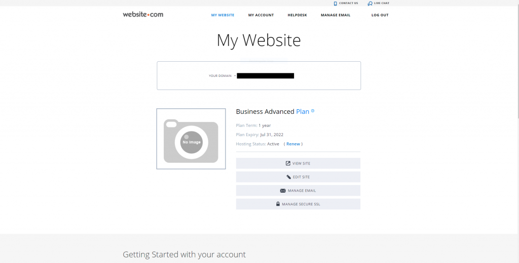
After choosing your domain name, click Edit Site to start creating your landing page.
Choose a marketing page template
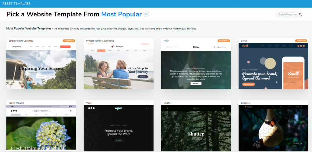
Next off, it’s now time for you to choose a template, or build your marketing page from scratch. There are over 500 website templates created by Website.com’s website designers, each fitting different needs and different moods.
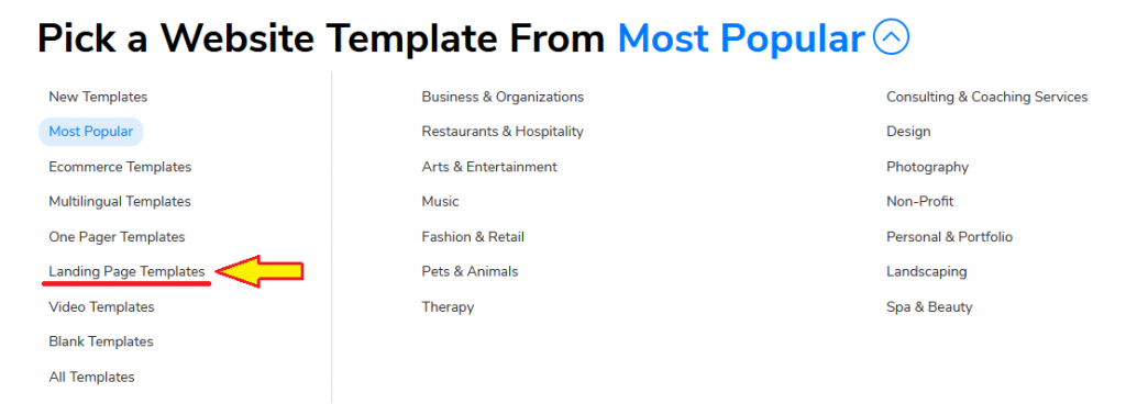
Click Most Popular then Landing Page Templates.
I’ve chosen the Legal Advisor website template for this demonstration.
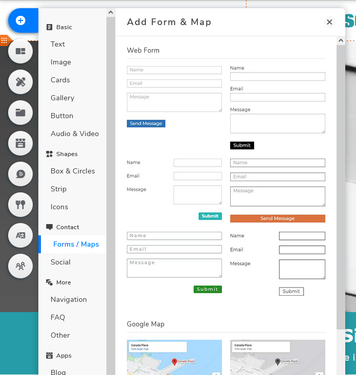
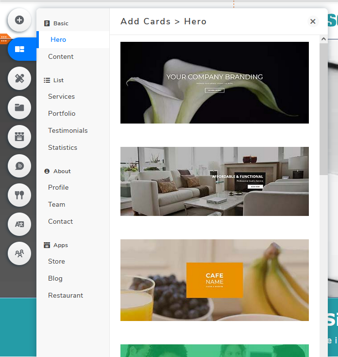
To add additional elements, click Add Elements or Add Cards.
Add Elements
Add Cards
Existing text and images are temporary placeholders to show you the layout of the website templates. You can definitely customize (and I strongly suggest doing so) to fit your needs.
To customize existing text, click the one you wish to edit and press Edit Text.
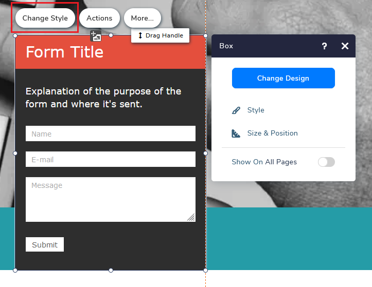
To change the design of a card, select the specific card and click Change Style. This is where you can change the background, border, shadow, size, etc.
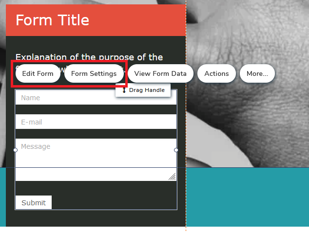
Next: Edit Form and Form Settings
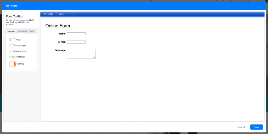
Edit Form is where you edit the content of the web form—add, delete, edit and reorder the web form fields.
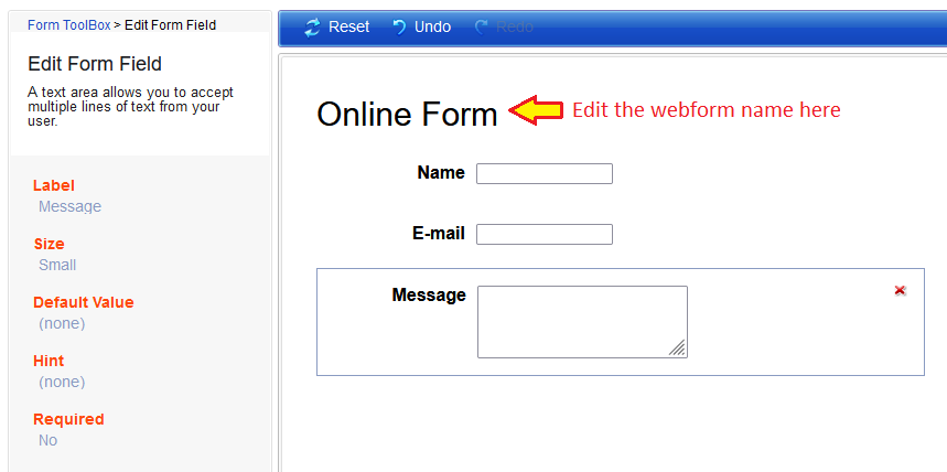
Click on specific fields to further customize the field settings such as changing the field name, form name, editing mandatory settings.
Remember to click Save at the bottom right after editing. If not, everything will be gone immediately if something went wrong (computer shutdown, website crashed, etc.)
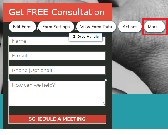
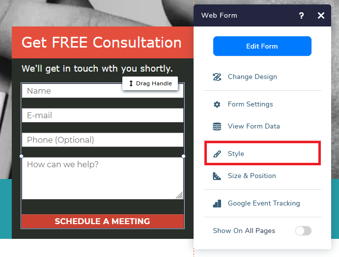
While you can edit the content of the content form via the above method, there is one particular element that will need to be edited elsewhere—Submit Button. You will need to go back to the visual editor and click on the web form, then More.
Next, press Style
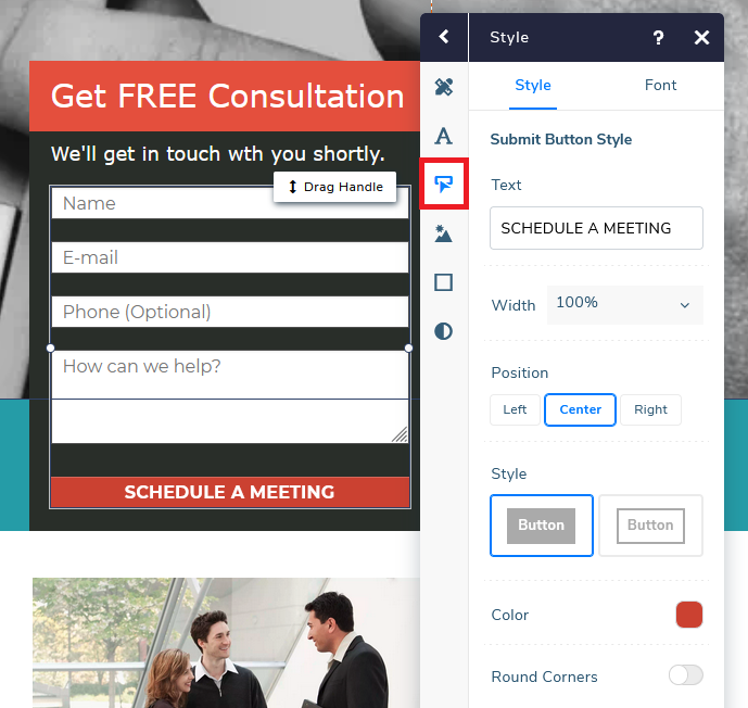
Click the third button, the Submit Button, and start customizing the details and design.
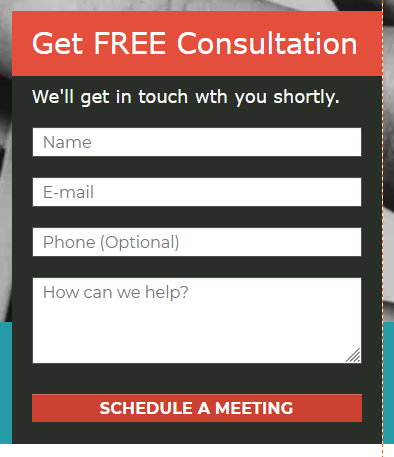
Here’s the customized web form
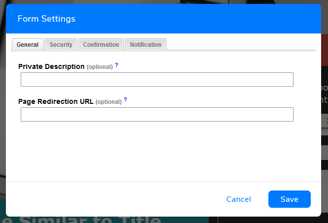
Form Settings is where you can set a redirect link, customize confirmation messages, set email notifications, etc.
Here are some actions I would take to personalize and protect the web form:
- General > Page Redirection URL – You can opt to create a “thank you” page or redirecting people to a specific page you want them to land on (e.g. homepage).
- Security > Form Protection (CAPTCHA) – Activate to protect your web form from spams
- Confirmation > Custom Page Message – If you do not prefer to redirect your visitors to another web page upon submission, you can also choose to add a customized message. If you leave it blank, the system will generate a default message.
- Notifications – You can choose whether you would want to receive email notifications upon every submission received.
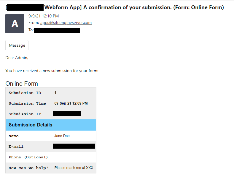
If you have enabled email notifications, you will receive these in your mailbox as soon as users input their details and successfully submit the form.
To review the web form data, you can:
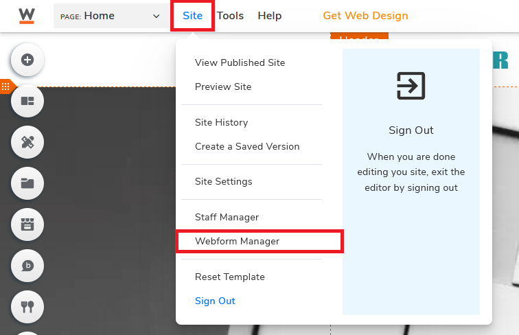
Method ONE: Go to Site, then click Webform Manager.
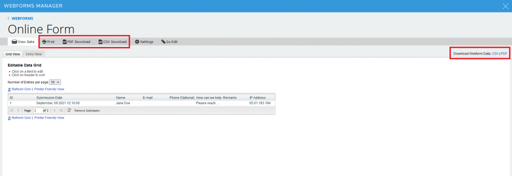
If you have more than one web form in your website, everything will be shown and sorted accordingly here.
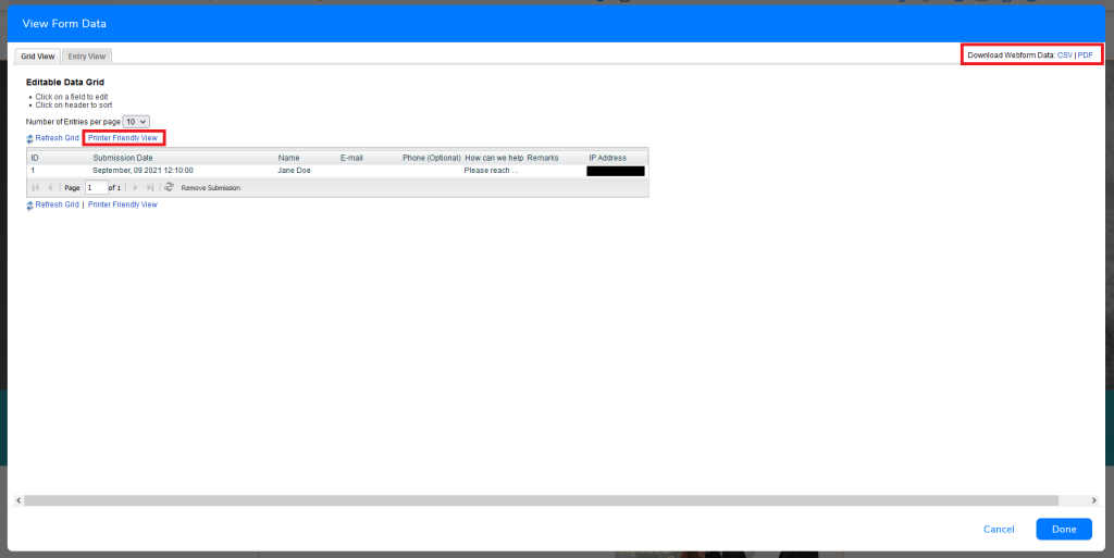
You can also print and download the data in CSV or PDF format.
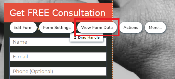
Method TWO: Click on the web form in the visual website builder and click View Form Data.
Same as the other interface, you can also view, print and download the data here.
Optimize your marketing page for mobile
By mid-2021, there are nearly 6.4 billion smartphone users across the world, and it is expected that the number of users will increase to over 7.5 billion in 5 years. And by the first quarter of 2021, over 50% of the global website traffic came from mobile devices. Without one mobile-friendly marketing page, imagine the number of visitors you are potentially missing out on.
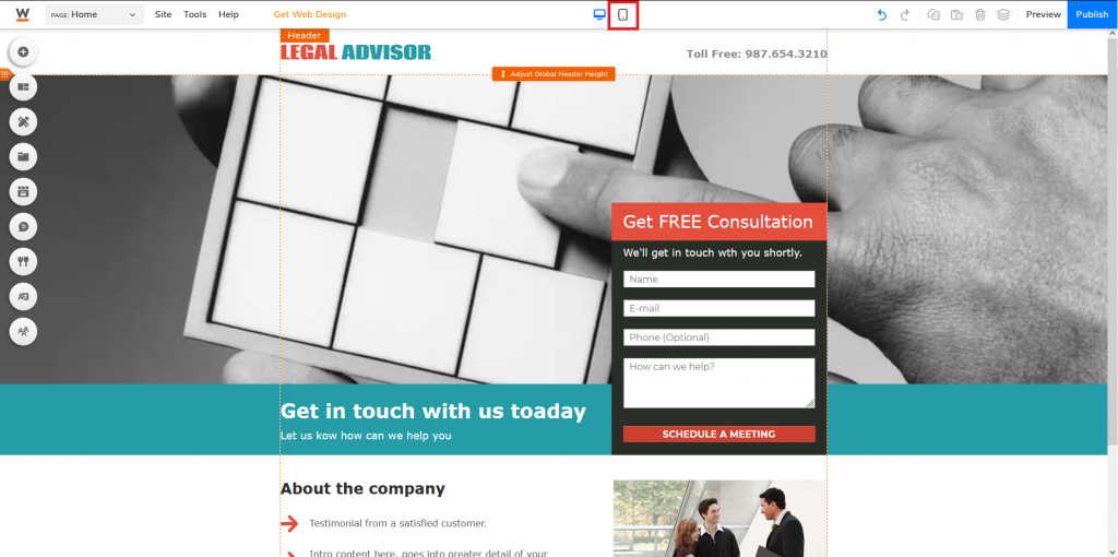
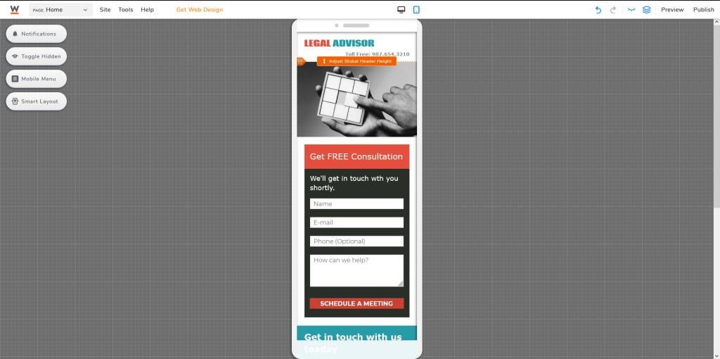
Go to the top of your visual editor and click on the mobile icon (right in the middle).
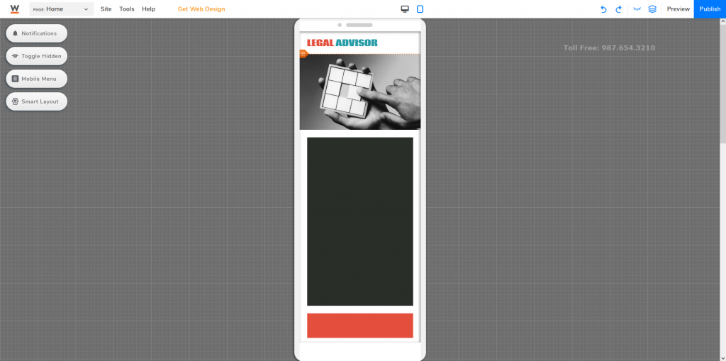
Elements, however, might not automatically resize for mobile. To resolve this, you’ve got two options.
Method ONE: ActivateSmart Layout allowing the system to try and fit everything correctly. Just be prepared that this method might not always work and you might still need to do some manual customization by yourself.
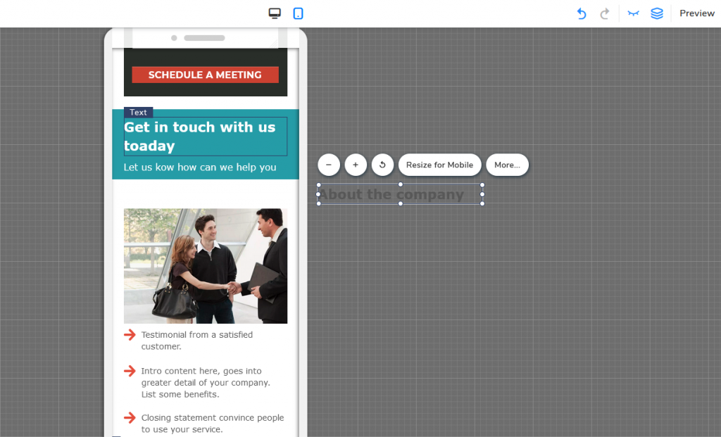
Method TWO: Skip the smart layout option and drag elements one by one. You can click Resize for Mobile when selecting a specific element, and later fine-tune everything for better visuals.
Not everything you show on a bigger screen suits mobile screens. In some cases, you might want to hide certain elements to achieve a better user experience. To do so, you can just drag elements out of the frame or click on the specific element and press Hide From Mobile (the closed eye icon).
Your marketing page is pretty much ready to go live. Just do one final check and make sure everything is in place. Click Publish to launch your landing page.
Marketing Page Good Practices
Creating a marketing page might be easier than you would have imagined. There are plenty of platforms like Website.com’s website builder, and fully make use of their pre-built landing page templates to create one for your business. However, to create a good marketing page that drives conversions, here are a few general good practices to consider following.
-
Limit the number of navigation options
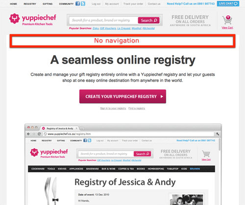
You are promoting a specific product/service, not your company. All you should do is provide only what is needed. The more additional links you provide, the more distractions there will be, the higher chance your visitors will get lost while navigating your marketing page. Worse, leaving your marketing page and not returning.
-
Prioritize your content
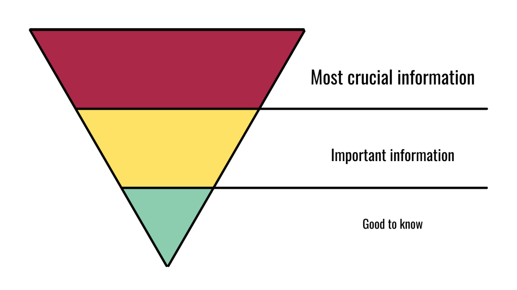
People on average spend less than a minute (52 seconds to be exact!) on a web page. If you leave the most crucial information at the very end of your marketing page, there is a high chance your visitor might not even get to that piece of content before closing the tab. Use the inverted pyramid structure to prioritize your content—the most important piece of information at the top, less crucial nearer to the end of the marketing page. While people will still tend to scroll through the web page, you can never predict how many of them will actually scroll till the very end.
-
Focus on what you can offer
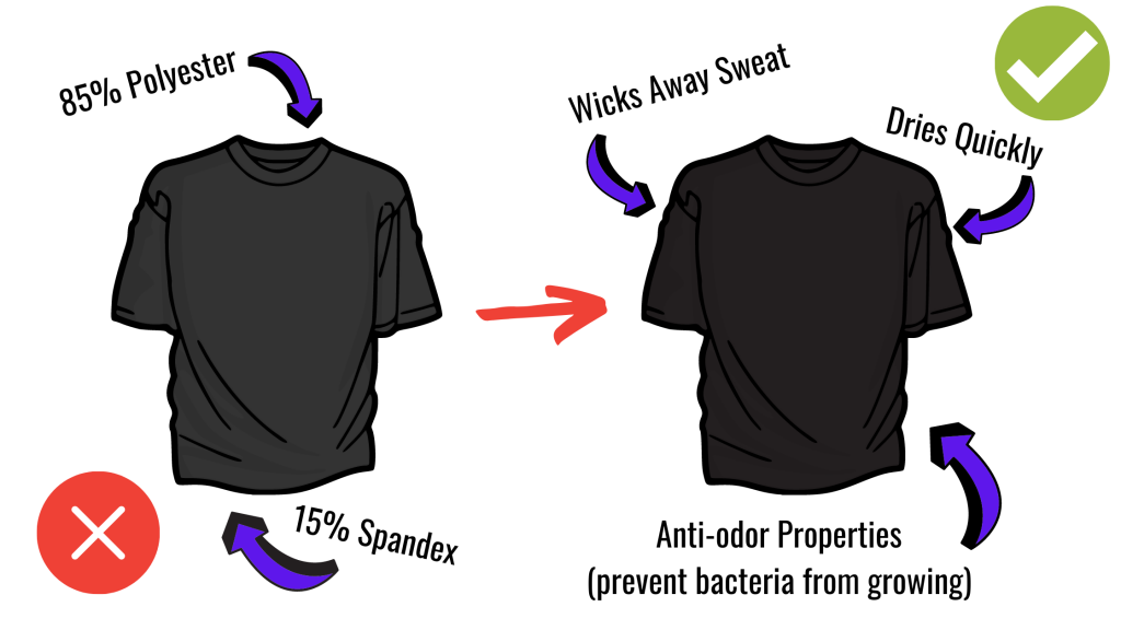
This is a marketing page, you are selling a product or a service. Imagine you are doing a sales pitch, give your potential customers reasons why they should be interested. Tell them the benefits, what they can get from you and/or your product/service.
-
Keep it clean and simple
This is very similar to the idea of limiting your navigation links, but with an actual numerical suggestion. In the world of marketing pages, we have this term called attention ratio, which essentially refers to the ratio between the number of links of your marketing page to the number of marketing campaign conversion goals. And in an ideal world, the ratio should be 1:1.
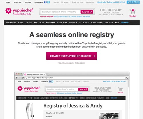
A good example from VWO, a market-leading A/B testing tool. They had previously conducted an A/B test for their client focusing on conversation rates and found out that by removing the navigation menu on the website, the conversation rate increased by 100%.
Source: VWO
-
Make your CTA button obvious
The CTA button is one of the most important elements of your entire marketing page. This is the element making conversions happen. The CTA button needs to be visible, separating them from all other elements so your visitors won’t miss it. Also, personalize your CTA, it tends to convert 202% better than the default and generic ones.
For example, the goal of this legal company (my example) is to convert visitors to clients. I’ve changed the CTA to “Get FREE Consultation” instead of “Contact us” for the heading of the web form; and customized it to “SCHEDULE A MEETING”, no longer using the default “Submit” button
The ultimate goal of a marketing page is to generate leads. Regardless of how you are using your marketing page, the main goal is to persuade your visitors to take action. Not everyone has the patience to try and understand what they need to do, therefore keep your instructions short and straightforward. You should be telling them what they need to do.
Now that you know what a marketing page is and how you can create one using the website builder that I’ve suggested from Website.com. You are now ready to create not one, not two, but multiple marketing pages, hopefully, you will be able to see the results soon!
